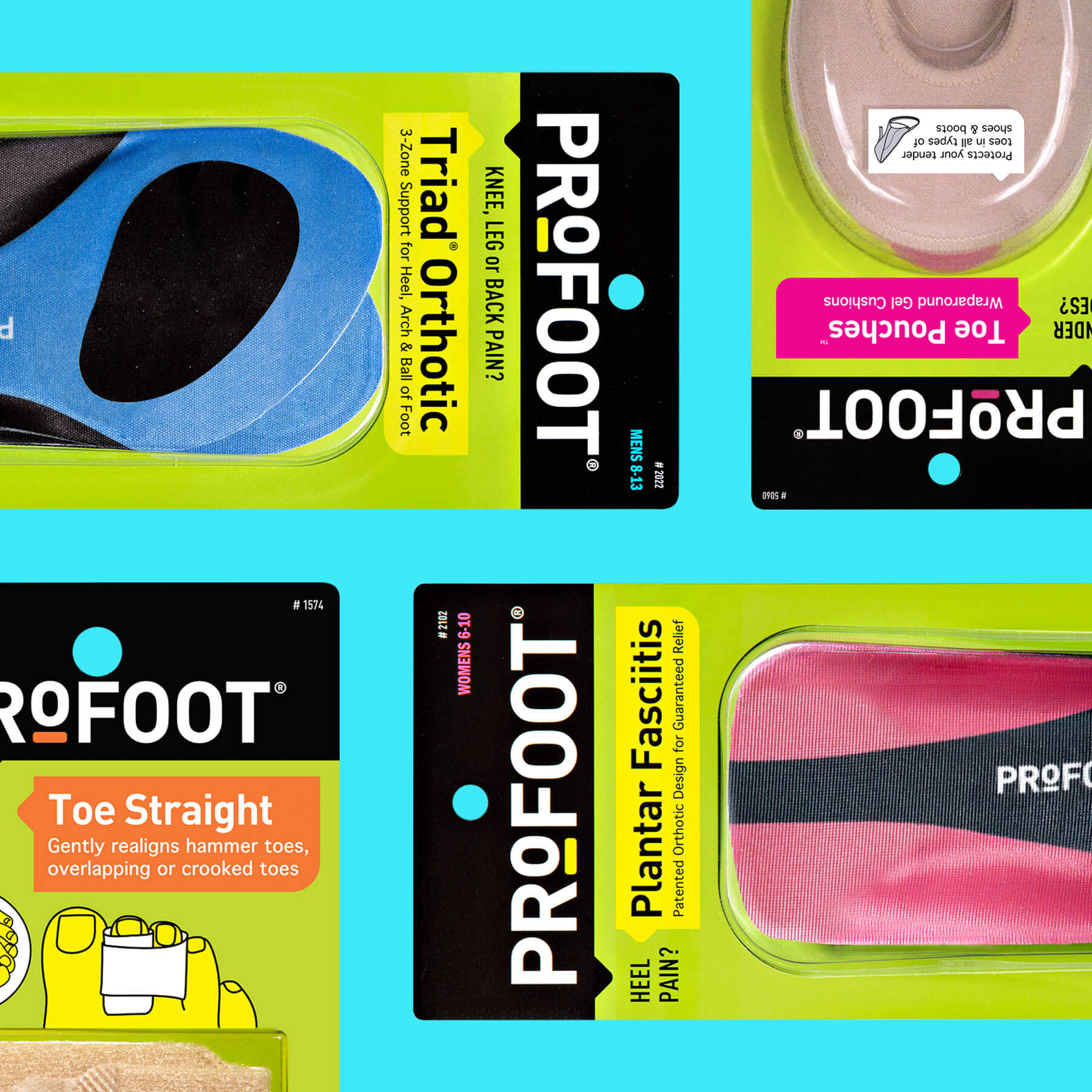
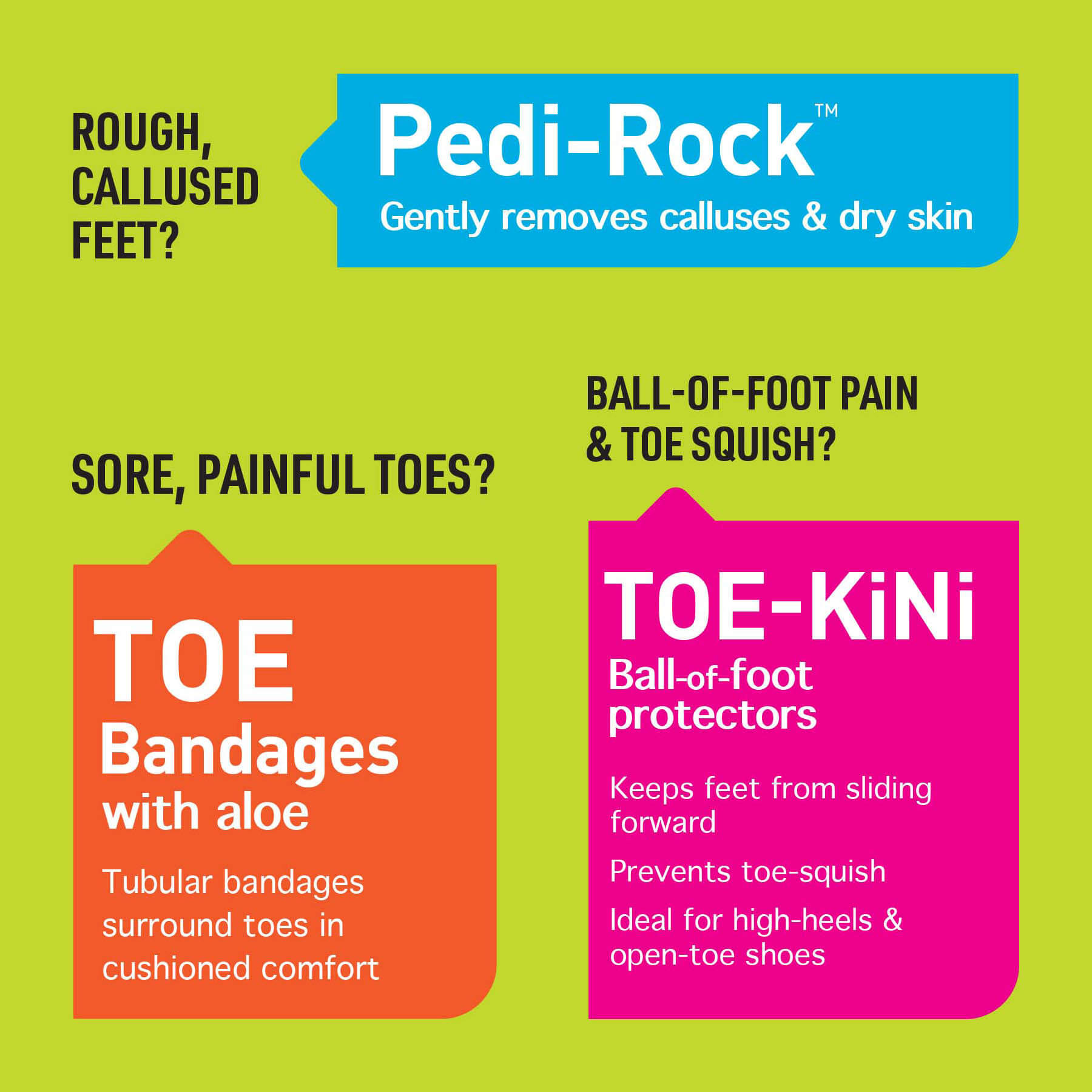
When ProFoot approached GGB to revitalize their brand, they sought an updated look that maintained the brand’s equities. ProFoot is still the green brand, but its name is now at the top of the visual hierarchy—it is emphasized against a black background and a horizontal orientation across the entire franchise. To foster more consumer engagement, GGB reimagined the copy in speech bubbles, creating a conversation between consumer and brand.