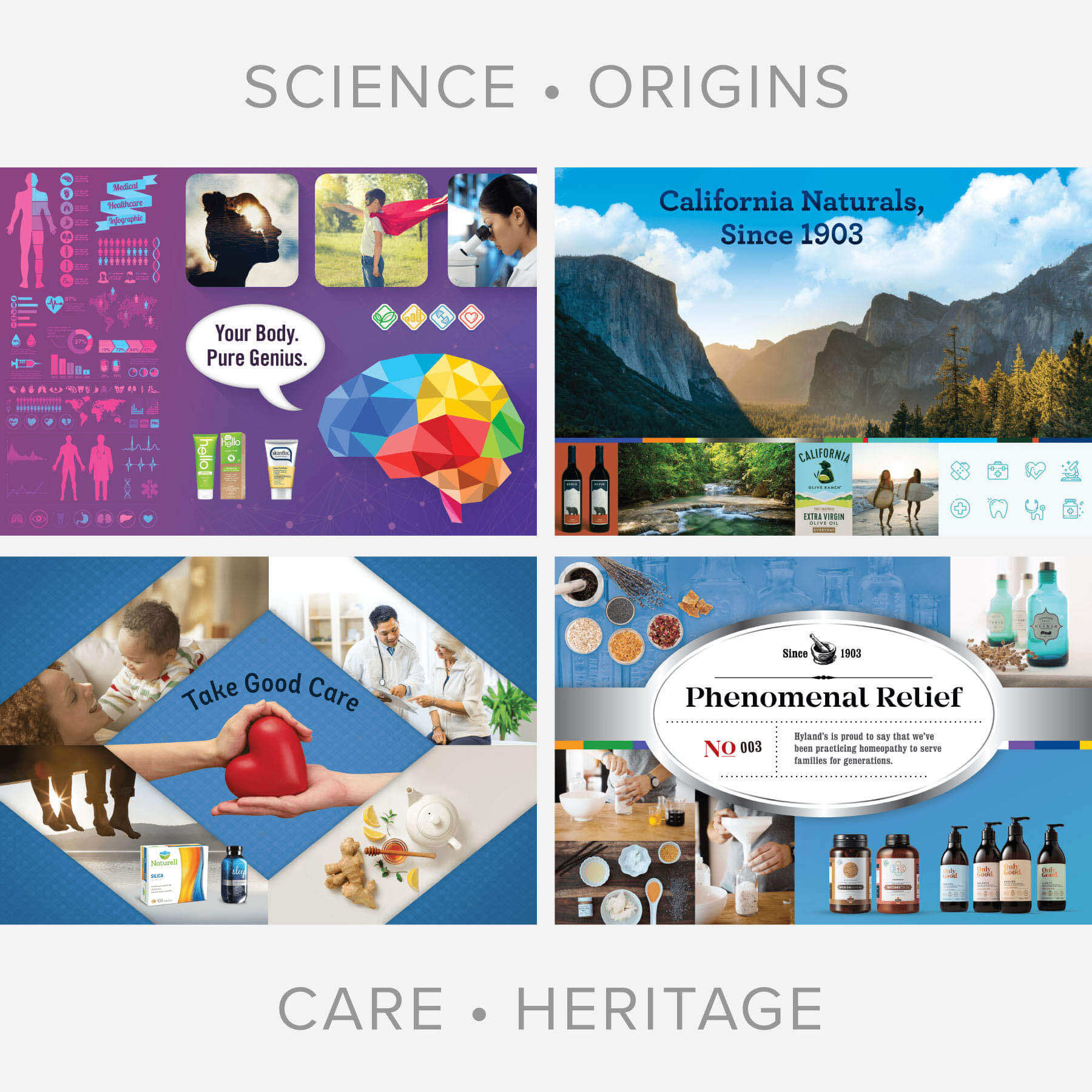
When tasked with updating the Hyland’s identity, GGB preserved its healing nature while enhancing legibility and modernity at the same time. The brand’s signature blue oval was retained, but subtle cues to nature were added to better convey the brand’s homeopathic roots. The result is a soothing identity that resonates with consumers across packaging and digital applications.