The right colors, package structure and product name helped the brand launch its new addition with great success.
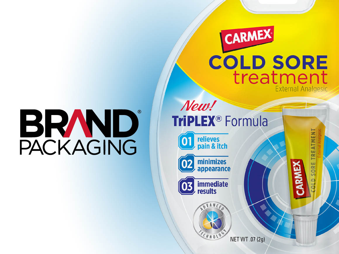
Carma Laboratories Inc., the manufacturer of Carmex lip balm products, was pleased to announce that its newest product, Carmex Cold Sore Treatment, was recently named a 2015 “Product of the Year” winner in the Specialty Skin Treatment category by Product of the Year USA — the nation’s largest consumer survey on product innovation. The packaging for this new item was designed by Goldstein Group Branding, New York.
“The Carma Laboratories innovation team began the product development process with research to better understand the cold sore sufferers’ experience,” says Jona Mancuso, director of marketing, Carma Laboratories. “Through this research, the team learned that the two biggest concerns for cold sore sufferers are pain, which reminds them that the cold sore is there, and the appearance of the sore itself, which can make the sufferer feel isolated and self-conscious,” adds Mancuso. “After a formula was developed that addressed both of these sufferer concerns, it was critically important to develop product packaging that clearly communicated the distinct reasons to purchase. Additionally, the packaging needed to differentiate this new product from existing products in our lip balm line.”
With a new formula developed, Carma Laboratories turned to packaging strategists at Goldstein Group Branding to create a brand image and sub-brand name. “Our SWOT disclosed three key opportunities for visual and verbal positioning,” says Terri Goldstein, principal, Goldstein Group Branding, “as viewed from our proprietary lens — the Shelf Sight Sequence — a methodology which enables us to understand the consumers’ sequence of cognition when recalling brands at retail: Color is always recognized first, shape is second, symbols third, followed by words.”
Although words are last to be recognized on shelf, they are foremost when developing a brand’s visual promise. “The wording is developed to ensure a reason-to-believe that is distinctive from the competitive set,” says Goldstein. “Once consumers recognize the product, words play a meaningful role in the sales process and, most of all, are protected under trademark law. Finally, words populate the creative brief from which designers work to create an emotionally powerful visual language for the brand.”
“Although words are last to be recognized on shelf, they are foremost when developing a brand’s visual promise.”
–
Terri Goldstein
CEO & Founder, GGB
MESSAGING AND NAMING
Several competing cold sore treatment options exist, yet only Carmex Cold Sore Treatment claims to work on contact to block pain and itch while minimizing the appearance of a cold sore through technology that smooths and fills to make the cold sore less noticeable. Goldstein Group Branding created a variety of names and messaging platforms to capitalize on this brand opportunity.
“We developed 25 potential sub-brand names to best describe the unique technology, divided into three camps,” says Goldstein:
- Arbitrary: Imaginative names that create an associative connection, these have the benefit of being legally protected but may warrant more marketing support at shelf to become readily understood.
- Coined: Names that define a process, technology and/or active ingredient, these are also protectable.
- Suggestive: Names that clearly lead into the product benefits.
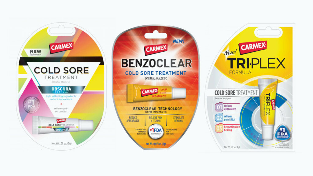
After a rigorous trademark search, three potential names were selected and matched to brand descriptors that enhance and clarify each.
VISUAL POSITIONING: BLUE IS THE RULE
An on-shelf audit revealed that the category code color for cold sore treatment is blue. “We wished to balance the established and recognizable Carmex yellow, red and black brand dress by adding a touch of blue,” says Goldstein. “We also explored additional colors, premium cues and symbols that could become the hallmark for brand advertising while clearly differentiating the new product from its Carmex cousin SKUs.”
STRUCTURAL ENHANCEMENT
Due to category saturation of competing products, coupled with the small size of the tube, Goldstein Group Branding designed a variety of new shapes for the blister pack, which command attention on shelf by breaking away from the expected shapes.
“It was important to Carma Laboratories Inc. and Goldstein Group Branding to create a brand imagery system that could be legally protected while presenting a design challenge to competitors,” says Goldstein. “The core identifiers — shapes, symbols and copy — have also been protected as important brand assets.”
“Carmex Cold Sore Treatment is on pace to exceed year one sales projections, and we certainly feel that collaboration with Goldstein Group Branding to develop packaging with strong shelf presence has helped contribute to strong item sales,” says Mancuso. “We could not be prouder of the newest addition to the Carmex family of products.”
For more than 78 years, Milwaukee-based Carma Laboratories Inc. has manufactured Carmex brand lip balms (www.mycarmex.com). Today, the company continues to produce its original lip care formula in its trademark jars and has expanded the line to include flavored lip balms, hydrating lip care formulas and soothing skin care products.
Terri Goldstein is the CEO and founder of Goldstein Group Branding, a brand identity firm based in NYC. The GGB team is comprised of a high-caliber group of strategic planners, graphic designers, industrial designers, copywriters and intellectual property experts.
Originally published in Brand Packaging Magazine, April 2015
