It’s been almost a year since I anxiously watched the news preparing to shutter my office. One trip around the sun later, there is finally some light at the end of the tunnel. While COVID might soon belong to the past, some changes brought by the pandemic are here to stay—besides remote work and stress wrinkles.
Above all else, social distancing protocols have exploded the growth of e-commerce. According to IBM, the pandemic has accelerated consumers’ shift toward online shopping by five years. That change is affecting my clients in over-the-counter medicines (OTCs) more than others. In 2020, growth of online shoppers in the OTC category was a staggering 44% according to McKinsey and Company, more than fashion, household goods or beauty—meaning products must adapt to the digital shelf or lose to the brands that do.
The change in this category may have been so drastic because there was substantial room for growth. “The OTC market has been slow to adopt digital strategies in part because of the heavy level of regulatory scrutiny under which the products are sold,” according to a report by IRI and the Kline Group. Now, the odds have changed.
As an OTC design specialist, I know this first-hand. According to some estimates, online sales in OTCs have gone from 2% to 33% in just three years. The challenge to transition to an omnichannel market is no small feat but understanding the sequence of cognition online and how it differs from the store can give your brand a significant edge.
“Products must adapt to the digital shelf or lose to the brands that do.”
This is what we call E-Sight Sequence™ and Shelf Sight Sequence™. All of my clients can recite the hierarchy by heart—color is the first thing consumers see (think “the purple pill”), shape is second, symbols are third and words are last. At retail, your eyes can scan a shelf and pick out your preferred brand in only 5 seconds. But online, the rule book is thrown out and the sequence rearranged.
Typing words into a search is the starting point for every purchase and the first step in the E-Sight Sequence™. Search engine optimization is key here. Next is color, still an important calling card, so utilize your ownable equities. Symbols take the form of social proof; starred reviews and seals of approval should be displayed prominently. Lastly, shape helps inform consumers of a product’s physicality. Keep in mind this process often takes more time than in-person shopping.
But how can packages be optimized to face the rising challenge of online shopping? Let’s use the Polish brand Aleric as an example, a global Rx-to-OTC switch that was revolutionized through my firm’s strategic eye. The colors exude relief while the package itself opens as a beautiful stage to inform consumers about the product. This visual vocabulary instantly conveys what the brand is about, without words. These strategies will work for both online and retail shoppers but when strategizing for e-commerce it’s important to optimize.
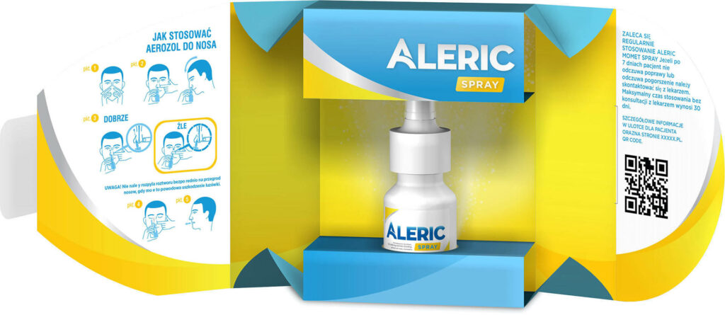
Aleric utilized the full potential of digital by creating an interactive call to action, a button that “opens” the package revealing the inside. In the absence of physical shopping, this engages the consumer in the way our carton design always intended.
COVID may soon be over but if you don’t want your brand to follow suit, face the challenge of e-commerce head-on!
Originally published in Branders Magazine, February 2021