With nods to a product’s past, Terri Goldstein helps to reinvent brands for the future.
Agencies find the ever-shortening timelines they’re asked to work under vexing. But when Terri Goldstein pitches work on behalf of her branding and package-design shop, she flips the script: clients are put on a stopwatch and told they’ve got a mere five seconds to evaluate which concept they like best.
Ms. Goldstein isn’t giving them a dose of their own medicine. She simply knows that’s how long a time-strapped shopper, breezing through the aisles of a supermarket or pharmacy, has to decide which product makes the journey from shelf to the checkout. Her 25-year career has yielded a host of such time-tested insights, which, combined with her gentle powers of persuasion and almost archaeological way of unearthing brand stories, has prompted many of America’s best-known brands to call upon Goldstein Group Branding.
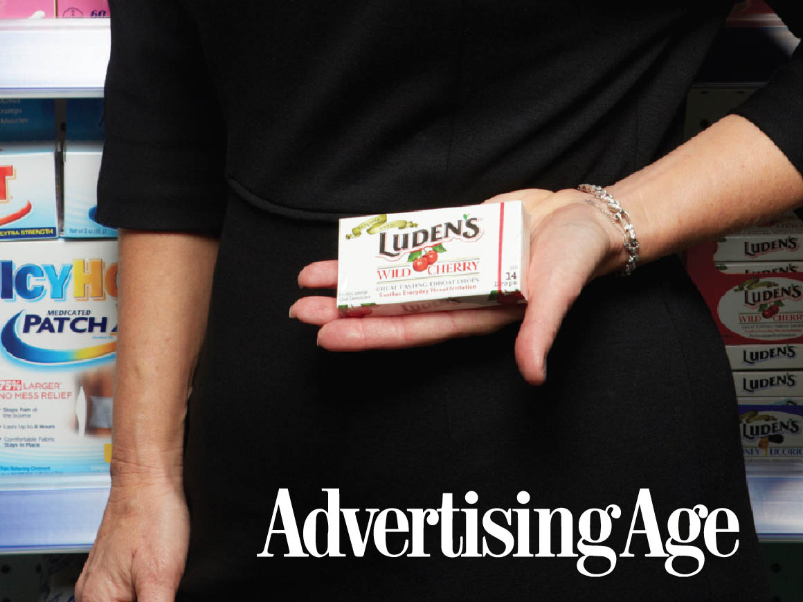
Tucked away in a nondescript office in New York’s gritty garment district, the firm’s portfolio is packed with case studies. The most interesting to Ms. Goldstein are heritage brands that get re-imagined, resulting in sales spikes. Among them: MoonPie, Gulden’s mustard, IcyHot ointment, ACT mouthwash, Cutex nail-polish remover and Luden’s cough drops.
Package design has been a red-headed stepchild of the marketing world, but the discipline is gaining new respect. Savvy marketers see packaging as valuable real estate and, when done right, a way to break through the clutter. Hundreds of food, health and beauty items are introduced each year, but according to the Harvard Business Review, fewer than 3% of new CPG products beat first-year sales of $50 million, considered the benchmark of a successful launch.
The British Brands Group published a study this year that underscored the dilemma for shoppers: a typical supermarket carries approximately 45,000 SKUs, while the average shopper buys about 50 items in 50 minutes. “They must decide what to buy in the blink of an eye,” the study said. “In order to make such fast decisions, consumers need to use mental shortcuts, or heuristics, to guide their choices. … Often consumers are not conscious of the cues or the mental shortcuts they have used to arrive at a decision.”
RESPECT FOR THE OLD
But Ms. Goldstein is conscious of all those things. She embarked on her path to becoming a branding and design maven early. Growing up in Sacramento, Calif., much of her childhood was spent either painting or studying the heirlooms in her grandfather’s pawn shop.
“Products would last for generations and I would watch as everything old became new again,” she said.
Ms. Goldstein earned a marketing degree from San Diego State University, and shortly thereafter came her first taste of adland in the form of an internship at DDB, Los Angeles. The shop shipped off the young and aggressive Ms. Goldstein to Houston to work in recruitment advertising, assigning her the Shell Oil account. From there she made her way to Manhattan, working at now-defunct ad agency Barnett Zlotnick. A turning point came in the early 90s, when she was hired by New York branding and package-design firm Wallace Church.
“It was so different from advertising, and I enjoyed it so much more because I was allowed to create the tangible product that the advertising was based on,” said Ms. Goldstein. “Working at the brand level instead of campaigns felt more long-lasting.”
A coworker at Wallace Church, strategist Cheryl Swanson, became a mentor. “She taught me the great lesson of going backwards to decide what to do for the future,” Ms. Goldstein said. “She’d say things like, in order to sell aspirin, we should know how society came to use it, and what it is made of. For example, did consumers know that it comes from tree bark?”
Eight years ago, Ms. Goldstein hung her own shingle. Goldstein Group Branding is a lean operation: a duo of creative directors and half-a-dozen designers highly focused on the 20 or so brands they commit to working with annually. About 60% of the firm’s business involves restaging brands to gain consumers’ reappraisal. The remainder is a mix of product launches, line extensions and brand-identity consulting.
The competition is stiff, and made up of much bigger firms such as Landor, Ideo and Interbrand.
“Her point of entry is high,” said Peter Mann, managing director at Yellow Wood Partners, a private-equity firm that invests in CPG brands. “She’s able to do what many firms who are competitors struggle to [do], which is gain entry beyond the marketing suite and into the CEO and boardroom and influence design decisions from the top.”
Zan Guerry, CEO of consumer-products company Chattem, which was sold to Paris-based pharma giant Sanofi-Aventis in 2009 for $1.9 billion, has for years worked with Ms. Goldstein on product launches and relaunches. “She’s our go-to person when we have an issue, when we’ve acquired something, or are relaunching something. She’s a design person but she’s a part of the marketing team. She brings a global marketing perspective and she sits down with us early on.”
Finding a seat at the table early—well before a logo or package design is conceived—is common for Ms. Goldstein. In the case of former client Bayer, she worked with the R&D team to change the shape and color of one of the tablet’s line extensions to oval with a thin orange stripe.
Finding a seat at the table early—well before a logo or package design is conceived—is common for Ms. Goldstein.
FIRST IMPRESSIONS
Much of her time is spent exploring major retail chains such as CVS, Walgreens, Walmart or Target, and then educating clients about how she sees consumers respond to the plethora of products on the shelves. She explains that during those few seconds shoppers use to make decisions, there’s an order to how their senses respond: the first cue is color (blue is associated with safety), followed by the shape of the product packaging, then symbols (think the Starbucks Siren) and lastly, words. Rather than creating PowerPoint presentations, she pitches ideas to clients displayed on mock shelves to illustrate what really pops against the competition.
Ms. Goldstein wants her clients’ brand look to be “ownable,” meaning it can carve out its own niche in terms of look and feel in its product category.
Ms. Goldstein wants her clients’ brand look to be “ownable,” meaning it can carve out its own niche in terms of look and feel in its product category.
Getting there sometimes requires pushing clients beyond their comfort zones. She got the call when global pharma giant Sanofi-Aventis and Chattem were prepping the over-the-counter rollout of Allegra allergy medication. Given a tight timeline, she proposed a major departure for the category: bright purple packaging to symbolize strength, with a flourished “e” in Allegra. In its first six months on the market, Allegra hit over $200 million in sales and leapt to second place in the category.
Yellow Wood Partners’ Mr. Mann, who’s worked with Ms. Goldstein on upwards of 15 brand packaging revamps, describes Ms. Goldstein as a “good devil’s advocate.” She prods folks “to not be too afraid to make more significant changes, even on well-known, established brands, because it’s the significant changes that will move you ahead more meaningfully than just tweaking the old design.”
He recalled a scenario with Balmex diaper-rash cream, in which Ms. Goldstein’s recommended approach to the marketing team was far different than what was on the shelf. “Everyone grabbed their chest in heart pain,” Mr. Mann said, “but she gradually talked us through making that significant leap ahead in terms of packaging communications. We did it, and the pickup in consumer movement was very readable and significant.”
Ms. Goldstein also ensures that a heritage brand retains its most-beloved characteristics, and for good reason. A Yankelovich study two years ago found that 62% of Americans wish that more brands would revive older versions of their product designs, and 58% of Americans agreed that brands with a long heritage can be more trusted to create quality products.
For Luden’s throat lozenges, which have been around since 1879, she recommended keeping little touches such as wax paper in the package and the use of fruit symbols on the outside. Luden’s, along with a couple of other brands such as Pediacare and Efferdent, had been lying dormant at longtime parent Johnson & Johnson. Mr. Mann, then with a company called Blacksmith, bought the portfolio, reenergized the brands with Ms. Goldstein’s help, then flipped the brands to Prestige.
“They were businesses that nobody at Johnson & Johnson was paying much attention to,” said Mr. Mann. “We revamped all of those brands. … When we sold it to Prestige, the improvements that we made—and most of them were things Terri had done—gave them the permission to believe that Luden’s would become a brand that would much more quickly grow.”
Her higher-than-average fees “were entirely worth it,” said Mr. Mann. “What she came up with and what she did really made a difference in the success of the brands she worked on for us.”
“The better your product looks, the better shelf positioning you get,” said Chattem’s Mr. Guerry, who noted that shifting perceptions through advertising is getting more expensive. “In some cases, we have advertising, but it’s not $50 million worth of it, so the product itself has to shout “Look at me! I’m here.’”
Observers agree that in a two-screen and three-screen environment, using traditional channels to break through will be more and more challenging. The way the product looks will serve as one of the most-important marketing opportunities.
DESIGNING FOR DIGITAL ‘SHELVES’
A big challenge will be adapting package-design principles in-store for the burgeoning e-commerce landscape.
According to Pew Research conducted during the 2011 holiday season, nearly half of all adult mobile users turned to their phones while in the store, seeking help with purchase decisions. Simultaneously, more shoppers are eschewing brick-and-mortar to click away on Amazon or Drugstore.com.
Ms. Goldstein maintains that the same models of consumer psychology exist for shopping online. “The shelf has become the screen; the only copy truly detectable is price, ounces and a logo,” she said. “It is even more imperative in the online-shopping experience, as brands are condensed to a one-inch image, [that] they develop and own their own distinctive trade dress to create a visual vocabulary that may be seen, felt, understood and, most of all, recognized in a one-inch representation in one second or less.”
“There’s no more important aspect to running a consumer-products company than what your products look like at retail and what those products communicate through their appearance,” said Mr. Mann. “If the CEO of a consumer-packaged-goods company isn’t actively involved in the communications of his or her brands, then that person isn’t doing their job.”
Originally published in Advertising Age, December 2012