Terri and her design team help FMCG companies to position, identify and develop ownable brand core identifiers for brand packaging that can be fiercely protected. Her guiding design principle is based on a proven scientific methodology that understands consumers’ associative and deliberate sequence of cognition—both in-store and online.
Rush-hour, NYC, the corner of 34th Street and 7th Avenue, where 24,000 pedestrians depend on their internal GPS to navigate away from danger and closer to their destination—with perhaps a quick detour to buy a bottle of water for the train ride home.
Upon entering CVS, a person’s decision-making switches from survival to shopping mode, as consumers wayfind their preferred water bottle brand via four core identifiers: color, shapes, symbols, and words. These align themselves into two simultaneous decision-making lanes:
Lane 1: Functional Attributes—Is the water still or carbonated? Does it contain electrolytes? Is it flavored? Is the packaging glass, plastic, aluminum? Is it recyclable?
Lane 2: Emotional Associations—Do the product’s color and symbol combinations foster trial, prompt recognition or call to mind previous brand experiences and trust?
When combined, the functional attributes and emotional associations guide the consumer toward brand preference and (ideally) an ultimate purchase decision, which at retail is often arrived at in 5 seconds or less. But how does this decision happen so quickly?
Our mind’s eye is a powerful bio-computer. It maintains images of familiarity, pleasure, and learned experiences—both positive and negative. Visualization is how we think. Before words, we communicated through images. As we navigate the world, our mind’s eye recognizes people, places, and things through a particular sequence of cognition made up of colors, shapes, symbols, and words—in that order.
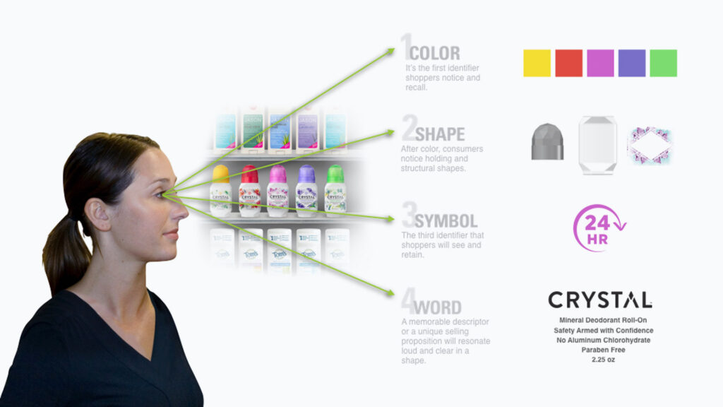
The right side of our brain is intuitive (emotional), while the left side is more deliberate (functional). When shopping for brands, our right, intuitive side of the brain interprets colors, shapes, and symbols first, creating an immediate visual imprint. Our left, deliberate side of the brain sees and interprets the words on the package, but only after our intuitive right side gains a full understanding of how a brand fulfills our emotional and intuitive needs through the package’s color, shapes, and symbols. Wayfinding your brand so that it may be found, understood, and seen in a traffic jam of “me-too” offerings is the key to brand success and a consumer’s ultimate purchase decision.
“Our mind’s eye is a powerful bio-computer. It maintains images of familiarity, pleasure, and learned experiences—both positive and negative.”
On-shelf our purchase decision is impulsive—made in as few as five seconds. You can touch the brand and see it in its true size and form, which allows you to quickly sense if it belongs in your cart and your life, via your intuitive/emotional right brain. The Sequence of Cognition denotes the way shoppers interpret on-shelf products quickly. Think about it—when sending someone to the store, we describe brands by colors, shapes and symbols: “Please pick up the white deodorant with the dove, green cucumber slices and the 24 hour symbol on it.” I bet you know what product I’m describing, just from the brand’s color, shapes and symbols.
Online, you lack the same sensory perception, as you often view the brand through a one-inch thumbnail representation. Here, you are drawn to color and shape the same as you are on-shelf, but your qualifying purchasing decision becomes more deliberate as you investigate a product further. You search through the brand’s star ratings, reviews, storyline, origin and social media—its symbols and words—all of which contribute to the deliberate/functional left brain’s final cognitive decision. Due to this careful deliberation, this decision may take up to one full minute, much longer than the rapid five-second decision made at shelf.
In both these neural-navigations, how a product is seen on-shelf or online can ultimately impact a consumer’s purchase decision. When designing your brand’s packaging, you must take the sequence of cognition (both on-shelf and online) into account by strategically developing a number of brand elements:
- Develop your brand’s storyline so that it may be turned into an on-pack visual vocabulary that the consumer’s mind can quickly interpret.
- Assign memorable, ownable colors, shapes, symbols and words—in this sequence—to bring your storyline’s key points to your consumer’s visual consideration.
By building both intuitive and deliberate cognitive connections for consumers, brands today can encourage a continuous consumer purchase loop and improve upon their traffic flow both in store and online. Today it is key to understand that as brand designers we must be much more than just decorators hired to design an “attractive” package. We need to be brand navigators. We must essentially construct a strategic map onpack, with components that compel the consumer’s mind to choose a brand and develop a loyalty to it.
Originally published in Branders Magazine, May 2019
