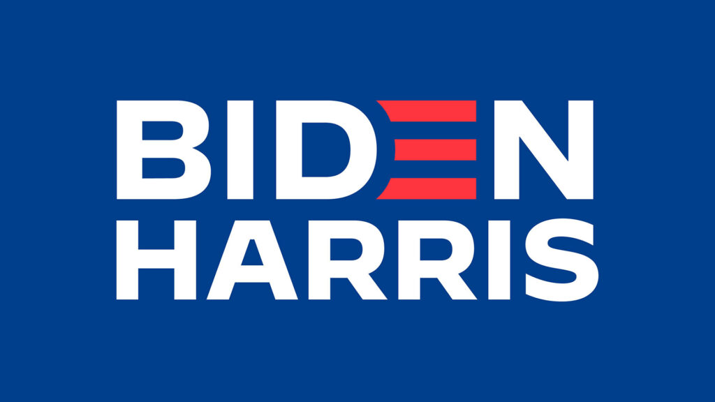
In August, Joe Biden announced that Kamala Harris, California Senator and his primary rival, would join his ticket for president of the United States. With this announcement also came a new campaign logo. You’ve probably seen it. It’s a simple san serif font painted a deep blue except a singular red “E” transformed into something that loosely resembles the American flag. Robyn Kranner, senior creative adviser for the Biden campaign, told Fast Company “[It] represents an America that is strong, bold and unified.”
This seemingly simple logo also represents countless hours of design strategy and thinking. It’s a brand. A brand propped up by billions of dollars in contributions with higher stakes, but a brand nonetheless. As someone who’s worked with brands my entire career, I see design thinking and branding everywhere. Political campaigns often hire people like me to advise and create their brand identities, employing the same visual tools as with consumer brands. In fact, marketers and brand managers can learn a thing or two about design strategy from politics.

Campaign design must appeal to Americans in the same way brands do. It’s an important reminder that design itself can communicate a position without needing words; every element from the color selection to the hierarchy can convey a potent message.
“Strategically, what I interpret from the mark is a strong sense of partnership—a unified front. The candidates are being presented as a team. Their names are more even both in scale and weight,” Douglas Sellers, executive creative director of Siegel + Gale said about the Biden-Harris design. It’s simple and straightforward by design, not disruptive, but it evokes a return to normalcy and stability.
Its colors are slightly brighter than the Trump-Pence design whose less polished logo came to represent an anti-establishment and anti-elitist message by rejecting traditional aesthetics and eschewing graphic design agencies. Both strategies have shown to be effective with their target consumer (voter). We’ll find out whose brand resonates best with the largest swath of the American public, but the lessons for traditional brands are already available.
“Campaign design must appeal to Americans in the same way brands do.”
Strategic design starts with the end expression and works backward. What do you want to communicate to your consumer and how can you do that through design? Colors are emotional and evocative and deserve careful consideration. Will you be yellow—young, fresh and happy? Or blue—clinical and serious? Fonts, shapes and logos all communicate subconsciously and heavily influence consumer recognition and decision making.
When designing the Allegra brand, my company, The Goldstein Group, took a strategic approach. We selected purple to differentiate from existing offerings, capitalizing on its association with royalty and quality. The “e” was designed with a fluid swooping motion to suggest speed and relief. Allegra’s market success is proof enough that well-executed design can lead to dominance.
Beyond beauty, strategy is the difference between good design and effective design.
Originally published in Branders Magazine, October 2020


