Breathing new life into a major over-the-counter brand.
The Project
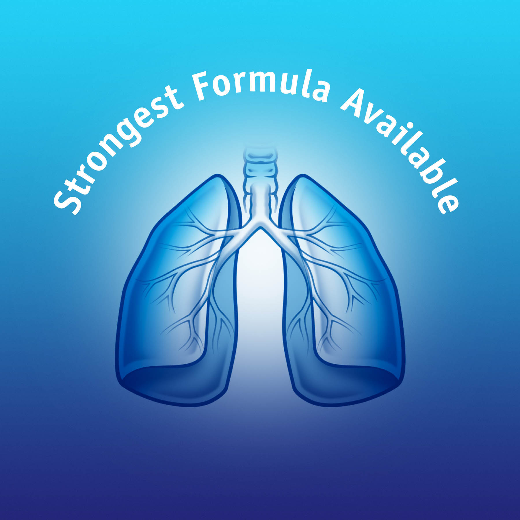
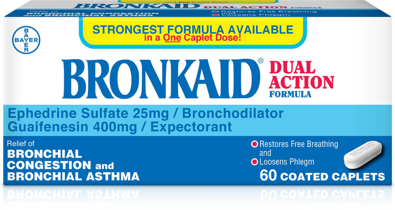
Bronkaid needed to communicate its key reason to believe: it is the strongest formula available in a single caplet dose. With a relevant and updated visual positioning, GGB developed a blue cross built into the contemporary logotype to serve as a seamless efficacy cue. The brand architecture was recreated to house both a usage icon and the caduceus for reassurance, as the core identifiers of red, white, and blue were reinterpreted for shelf vibrancy.