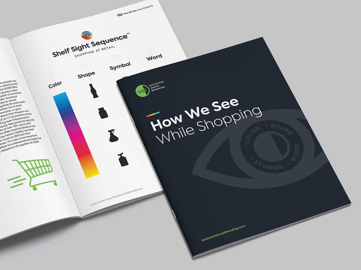
Based on real consumer insights, the four steps of the Shelf Sight Sequence™ capitalize on the brain’s natural sequence of cognition and inform our consumer-centric brand designs.
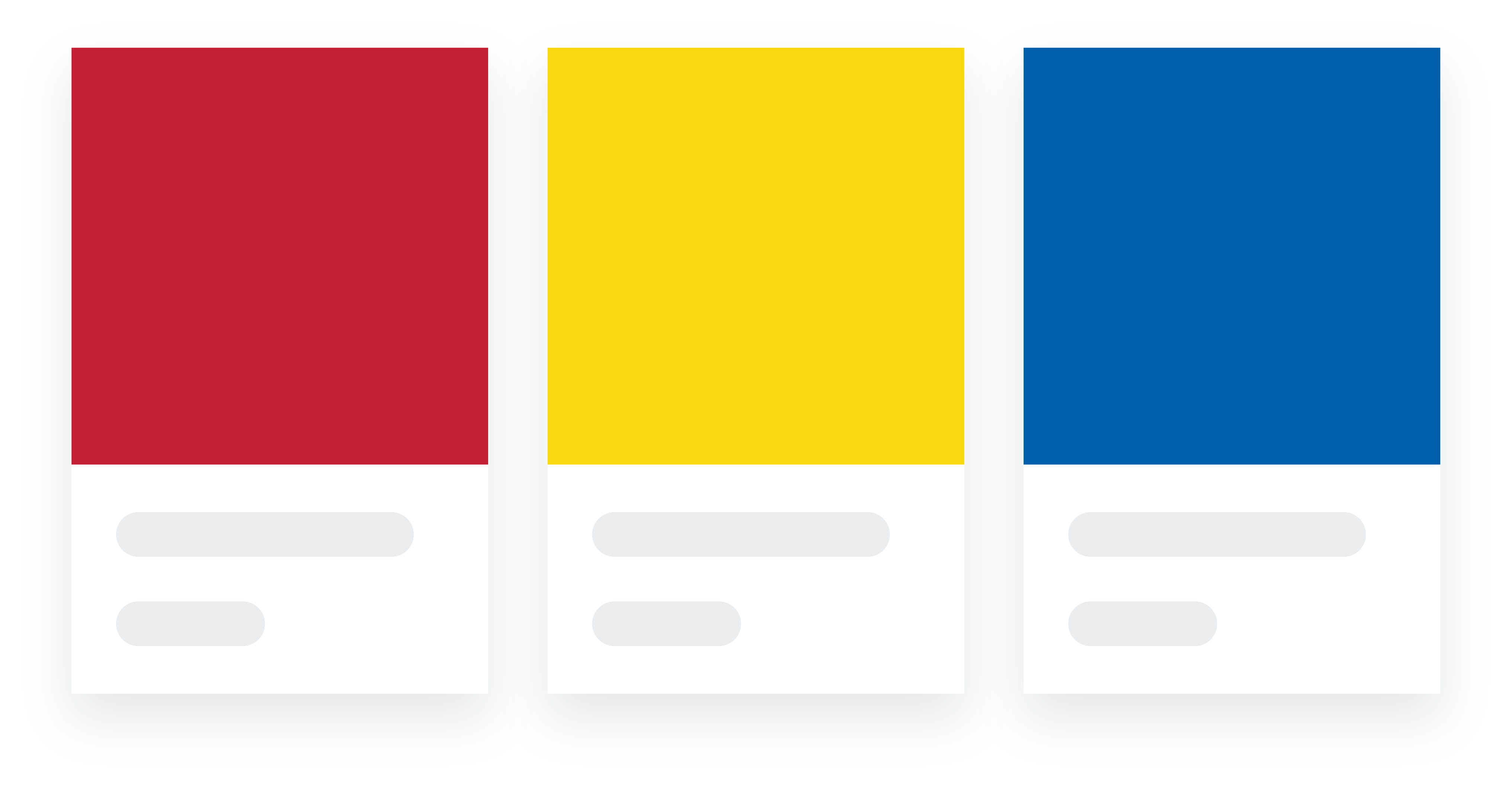
Color
Color is seen first and is the first identifier shoppers notice and recall. Color can inform to flavor and scent, but most importantly can be owned by a brand in the minds of consumers—and as intellectual property.
Shape
After color, consumers notice both iconic graphic shapes that serve as a “brand billboard” and structural shapes that inform usage and placement in consumers’ home environments.
Symbol
Symbols are third in the sequence of cognition. Symbols serve as instant identifiers imbued with meaning and trust that shoppers will see and retain on retail or digital shelves.
Word
Words are seen last. By creating a visual vocabulary in the same sequence of cognition in which consumers view your package, your words may now be quickly seen, felt and understood!