There are over 600 hotels in New York City. That’s 121,000 hotel rooms by some estimates. Most are unremarkable; some are historic. Then there are those that curate a glamour and mystique that attracts the rich and well connected.
The Standard is one such place. On any given day it’s a veritable who’s who of art, fashion and finance. The Standard is a group of luxury hotels spanning from Hollywood to London to the Maldives, and each one has its own flavor and style that fits within the larger brand’s identity. The interiors reference New York club culture, mixing downtown chic with 60s and 70s modernism and are fresh yet undeniably classic.
There’s no shortage of upscale hotels, so how does The Standard maintain its status and attract high paying customers? The designers behind the hotels borrow from the playbook of branding and product design, my specialty, using color to spark emotion. Dr. Bevil Conway, a scientist at the National Eye Institute states, “Color is a primitive form of information. It’s an emotive cue, so it’s an important differentiator for brands. It signals identity; it tells people what team you are on.”
The Angad Arts Hotel in St. Louis, Missouri took this concept to an extreme, letting guests choose the color of their room based on their emotions— “There are four colors in the hotel’s palette: yellow to boost happiness, blue to inspire tranquility, red to ignite passion, and green to encourage rejuvenation,” reports Well+Good.
“Color is a primitive form of information…it signals identity, it tells people what team you are on.”
When designing The Standard Hotel in London, Shawn Hausmen, interior designer, used a color scheme that he described as a bit unusual. “It was about setting those main colors, and then playing off what we’d call a disruptor, something that’s a little off,” he said.
In brand design we use disruptive colors when a category has become “a sea of visual sameness.” This can happen after smaller brands copy the color cues of a category’s main player. When Cortizone-10 became the red brand in the itch aisle, brands followed, creating a shelf full of red. When designing a challenger brand, it was important to disrupt the shelf with unexpected colors that pop out to shoppers.
Color is the first visual cue that people see—often in fractions of a second before other visual information is processed. Brands, from products on shelves to hotel chains, can use this fact to appeal to consumers.
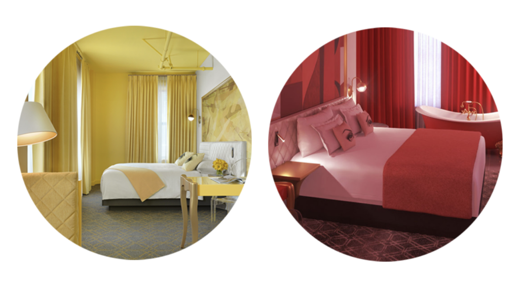
The Standard uses red in its logo and as an accent throughout its hotels. The color of passion, action and energy, red is an attention-grabbing choice. But each color on the wheel has its own meaning and understanding each is key.
Branding is everywhere. The more you look the more you see it. Understanding the science of design and color unlocks a world of opportunities.
