Night-sky-inspired packaging rockets MoonPie sales to new frontiers.
During Tory Johnston’s 12-year tenure at Chattanooga Bakery (Tennessee), which makes MoonPie marshmallow cookie sandwiches, he’s seen the brand enjoy terrific sales growth—even during the recession. “We kind of perk up in a down economy,” he says. “MoonPie is a comfort food and a trusted brand that people grew up with. It’s a relatively inexpensive way to relive those fond memories.” Even so, Johnston, vice president of marketing, saw an opportunity for growth. And it was all about the packaging.
“MoonPie is a comfort food and a trusted brand that people grew up with. It’s a relatively inexpensive way to relive those fond memories.”
–
Tory Johnston
Chatanooga Bakery
Johnston brought on board Goldstein Group Branding and charged the agency with this goal: Create a fabulously fresh look for Chattanooga Bakery’s No. 1 selling product—MoonPie Minis—that plays up the brand’s heritage in an authentic way.
MoonPie has plenty of heritage to play up. The sandwich was invented in 1917, when Earl Mitchell, Sr., saw a need for a substantial between-meal snack for local coal miners on the job. Mitchell was inspired by his bakery employees, who made their own snacks by dipping graham cookies into marshmallow. The company added another graham cookie and a generous chocolate coating to the recipe, and the MoonPie was born. Over the years it became a strong symbol of the Southern workingman—country singer Bill Lister sang its praises in his song “RC Cola and Moon Pie” in 1951.
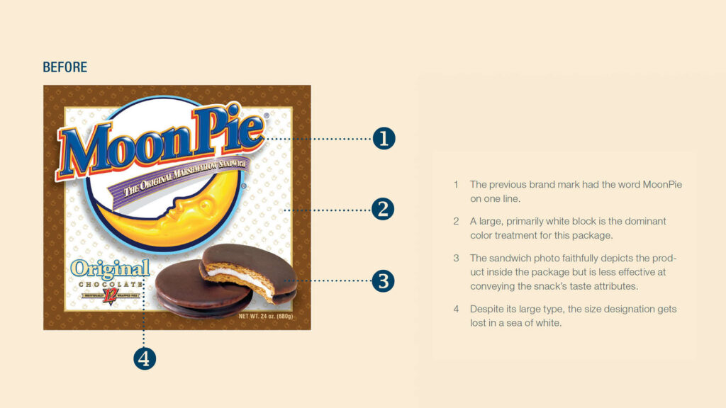
For much of the brand’s nearly 100-year history, middle-class Americans have been buying MoonPies in white packages with a blue-and-yellow logo. But the problem with MoonPie’s specific color combination was that it wasn’t unique or even unusual. When Goldstein Group Branding did a competitive analysis of the current marketplace, it found blue and white playing prominent roles in snack packaging for Entenmann’s, Little Debbie, Hostess, Mallomar, Tastykake, and Famous Amos.
A Heavenly New Look
To differentiate MoonPie Minis on shelf, its packaging was redesigned with a darker shade of blue than its competitors. Light-blue swirls represent the fluffy texture of marshmallow while adding depth to the graphic; small white stars complete the night-sky feel. “We love how the new packaging celebrates the night sky, overtly plays up the ‘moon’ part of MoonPie, and also transforms the white— which holds big brand equity for us—into a fluffy cloud,” says Johnston.
The changes to the logo embody the cosmic emphasis as well (see sidebar, page 26). And the product imagery represents a strong departure from how Chattanooga Bakery used to display its MoonPie sandwiches on pack.
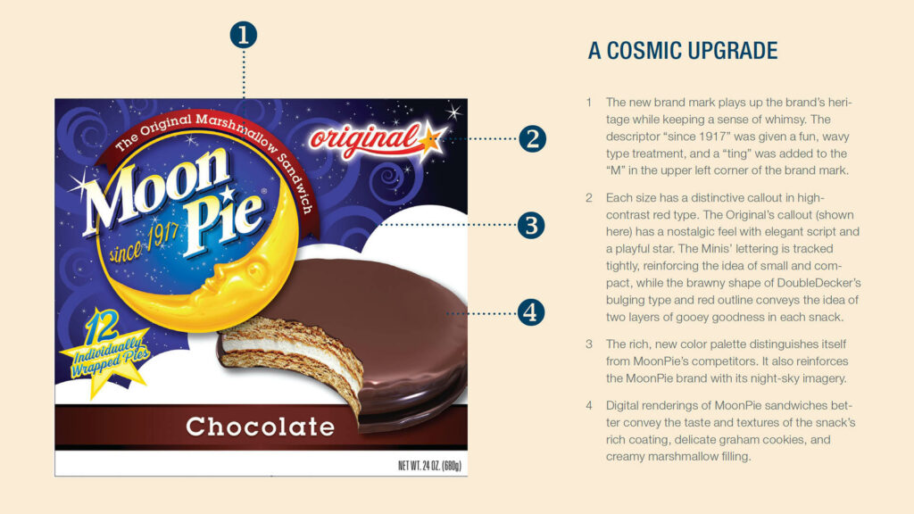
“The new beauty shot is probably the thing we had to be sold on most,” says Johnston. “We’ve always focused on making the product photo very literal, very true.” But Goldstein Group Branding insisted that merely showing the consumer what’s inside the package wasn’t enough. The image has to convey the textures of the pie’s rich coating, crumbly graham cookies, and light marshmallow filling.
So the agency suggested using high-end digital illustration versus photography for the product shot. “Digital rendering captures the highlights and the appetite appeal better than photography could ever do,” says Terri Goldstein, founder and principal.
The resulting illustration, says Johnston, “has unbelievable taste appeal.” There’s also a practical benefit. “From a printing standpoint, a digital rendering wins because it prints clearly and consistently,” he adds.
Made in the U.S.A.
The new design is printed by Southern Champion Tray, LP, on recycled 0.020-pt. clay-coated backboard for the cartons and trays, and by The Robinette Company on 80-gauge metalized polypropylene film for the twin-pack wrappers. Both package converters are U.S.-based companies.
“We use 100% American packaging vendors,” Johnston says. “As an iconic American brand, that’s not negotiable. And why look anywhere else?” Johnston has been pleased with his vendors’ costs, quality, and service.
The original design was set up to print in both process and spot colors. Johnston hired a freelancer to convert the design into a pure CMYK job, which would negate recurring spot-color printing costs for MoonPie Minis cartons or trays. The twin-pack wrappers are reverse-printed with nine colors, including a PMS 2728 blue, on a servodriven press. A clear polypropylene layer is printed and then laminated to a metalized layer. The results are twin-pack wrappers so vibrantly colored that they virtually command a shopper’s attention. The finished multi-layer film also provides excellent barrier properties, which increase shelf life.
Not that it’s needed. “In our chain-wide distribution at Cracker Barrel, sales of the Minis in the new packaging have really picked up,” Johnston says. “It looks like we’re heading for a double-digit lift.”
Ecstatic with the results, Chattanooga Bakery plans to use the new design to help refresh packaging for the entire MoonPie product line. Goldstein Group Branding has already adapted the design for the other two MoonPie sizes, and the new packaging will start hitting store shelves in the second quarter of 2012.
Originally published in Brand Packaging Magazine, Jan/Feb 2012