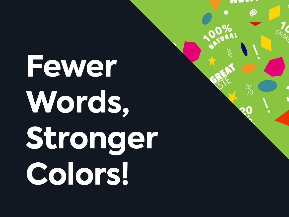
Fewer Words, Stronger Colors!
Today’s retail environment is unlike any we have ever experienced. The complexity of brand SKUs and myriad Point-of-Purchase (POP) materials bombards the shopper, making it almost impossible for individual products to stand out on shelf.
Despite brand marketers’ belief that the words on pack are the most important driver of purchase intent, recent studies demonstrate that they are actually the least important component of the packaging mix. In fact, the operative communications hierarchy puts color atop the list, with shapes, symbols and words following in that sequence. When approaching a package redesign it is this hierarchy of semiotics that ultimately drives sales in the store aisles.
Step 1: Colors
Studies show that on average shoppers take just five seconds to locate and select a given product, generally at a distance of from three-to-six feet. Locating that product occurs when it is visible to the passing shopper. Here visibility is measured by contrast and the physiological driver that creates contrast is color. Color is one of the brain’s three visual pathways and, since we process every object within view simultaneously, color is the mechanism that places emphasis on certain areas. In addition to enhancing on-shelf visibility, the appropriate use of color can increase brand recognition by some 80%, while also serving as an important brand identifier.
“In addition to enhancing on-shelf visibility, the appropriate use of color can increase brand recognition by some 80%, while also serving as an important brand identifier.”
–
Terri Goldstein
CEO & Founder, GGB
Step 2: Shapes
While color works on one level, it is not the only factor leading to product selection. Memorable shapes also initiate a cognitive process of evaluation and brand preference. Shapes often determine the first impression of a product while metaphorically communicating key benefits and advantages. In combination, color and shape combinations can signal quality, while enhancing perception. For instance, symmetrical shapes pair well with passive colors… triangular and diamond shapes with active colors. Color/shape combinations can also communicate brand personality, so like color, the use of shape in brand identity and design plays a role well beyond on-shelf visibility.
Step 3: Symbols
Symbols are a nearly instantaneous means of communicating meaning — think about the Starbucks® siren. Associations derived from symbols become imprinted in consumers’ minds through repeated exposure, and shoppers intuitively gravitate to familiar symbols to help them navigate the shelf.
Step 4: Words
Research has shown that a package cluttered with claims fights for attention and creates shopper conflict. The best approach is to focus on a single competitive point of difference that distinguishes a brand from the competition. As previously discussed, colors, shapes and symbols all enhance on-shelf visibility, elicit an emotional reaction, and aid in the final purchasing decision. So it stands to reason, that the more words one adds to the design, the less the opportunity to use color, shapes and symbols effectively.
Despite today’s retail realities, and the critical need to win at shelf, the art and science of brand identity and package design remains largely misunderstood and, therefore, undervalued. In a time when so much of a product’s success has migrated from the marketer’s hands (shelf placement, breadth and depth of distribution, retail pricing, POP displays, etc.) to the consumer, package design remains one of the options the marketer completely controls.
Strategic and informed package design is a must, which can only be accomplished through a carefully engineered sequence of color, shapes, symbols and words.
Originally published in Food & Beverage Packaging, June 2011