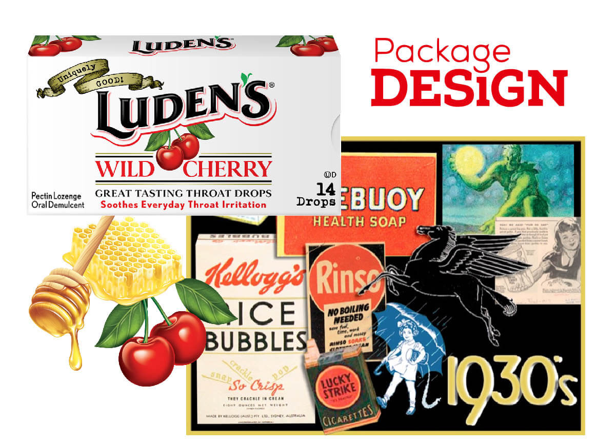
Luden’s mines the past to rediscover the brand’s unique sweet spot on the line between medicine and candy.
Are Luden’s throat lozenges medicine? Not exactly. Are they candy? No, not that, either. The brand instead occupies a narrow category niche that might be best described as “an everyday remedy for the occasional ‘throat-tickle’ relief.”
At retail, the growing domination of Halls and Ricola had precipitated Luden’s recent recession into the background and onto the bottom shelves. The brand was essentially disappearing from consumer consciousness.
Though still a beloved brand with a deep history (founded in 1879!) and loyal customers, its cough drop boxes and bags were perceived as dated and “old world.” The brand owners brought in Goldstein Group Branding, New York City, to renew the brand while still retaining the past. After the redesign, Prestige Brands (owners of the Chloraseptic brand) bought out Luden’s by acquiring the previous owner, Blacksmith Brands.
“The brand owners brought in Goldstein Group Branding, New York City, to renew the brand while still retaining the past.”
A deep dive into the history of the brand, conducted by Goldstein Group Branding, revealed that Luden’s had two “heydays,” or periods of strong growth—in the 1930s and 1950s. The lozenges were a brand for the people, even supplied to World War II troops as part of their rations.
Recent research indicated that consumers were aware of the history of Luden’s, which was both a blessing and a curse. Though there were many positive associations with the brand, there was also a feeling that it was well past its prime.
Terri Goldstein, principal of Goldstein Group Branding, had a different take on where Luden’s had been and where it could go. She devised a strategy to mine the past for successful brand and packaging elements that could elicit “memories of a time gone by” in a way that would resonate authentically with contemporary consumers unfamiliar to the brand. As in the process of any package design refresh, the design of each element was guided by decisions about what to leave behind, what to keep, and what to reinvent.
“The design of each element was guided by decisions about what to leave behind, what to keep, and what to reinvent.”
What to Leave Behind
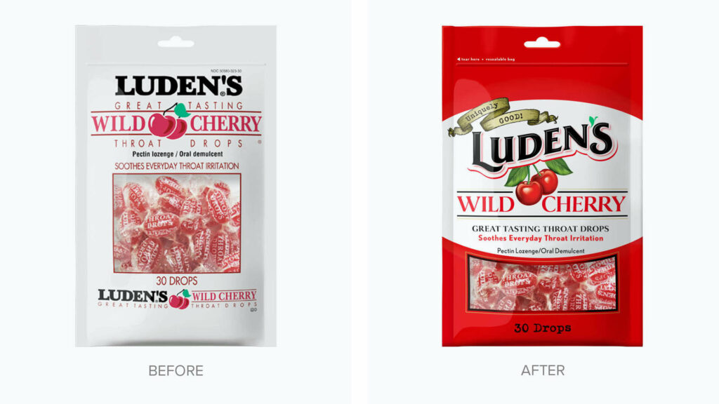
The biggest thing that Luden’s left behind was the unappetizing color on the carton of the “Original Menthol” cough drop flavor. This was not a shocking move, as every other Luden’s SKU was dominated by white, but it did serve as a bellwether of the brand’s significant break from the past.
Other design elements that got the ax: utilitarian design, stagnant type treatments, emotionless presentation, poor flavor indicators, and the lozenge illustrations on the Original Menthol and Honey Licorice packages.
What to Keep
One remarkable aspect of this project is how much was not left behind. A quick glance at the front panels of the new boxes reveals that every letter of every word on the old Wild Cherry, Honey Lemon, and Honey Licorice boxes was transferred to the new package design. The sole exception in the carton line was the name change of the menthol variety from “Original Menthol” to “Cool Menthol.”
Goldstein also explains how keeping white as the brand’s core identity was never in question. When shoppers are looking for their brand at retail, she says, “Color is always first, shapes are second, symbols third, and words are last.” Another part of the package that was kept was the wax paper inside the box, which has long been an integral part of the brand experience. Keeping the wax paper reinforces the authenticity of the product and connects the new design to the past.
What to Reinvent
Goldstein explains that the redesign of the Luden’s logo builds on the most relevant parts of the brand’s heydays. The curve of the letters produces both motion and emotion, and a white “halo” is suggested by the framing, color-coded “underscore” that traces a white border around the bottom of the letters.
Goldstein was excited to have the opportunity to reinvent the flavor “stories” on the packages. The goal was to create extremely appetizing graphics that hearkened back to an era of soda fountains and dime-store candy shops. The quantity identifiers were also updated with an old-school sensibility, as the courier typewriter typeface suggests handmade, small-batch care.
The boldest new design element is the banner announcing that Luden’s is “Uniquely Good!” Along with the new green-leaf apostrophe in the logo, Goldstein believes this pushes the brand’s natural, “good-for-you” positioning.
Consumers may not immediately recognize the changes. But that’s not a problem, according to Goldstein. The real truth, she says, is a package “that looks the way it always should have looked.”
Originally published in Package Design Magazine, April 2011